This post may contain affiliate links. Please read our privacy policy.
 If you are following this Blogging 101 Series, you may have caught yesterday’s post, Choosing a Layout – Part 1. Well, we are back today as promised for the second installment on this topic. Today, Katie and I are going to be discussing our Do’s and Don’ts of headers, footers and sidebars.
Header Do’s
Keep the size minimal. Readers don’t want to scroll and scroll past the huge image of your blog name just to get to your actual content. Ideally, the header should be around 200 pixels in height.
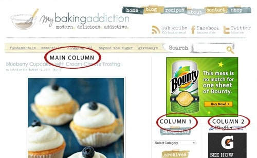
Include useful information in the header area. Links to pages such as: home, recipe index, about, frequently asked questions, contact, etc. are usually found in the header area. These subareas are typically found within a navigation bar, often referred to by design and web folks as a “nav bar”. Keep in mind that your ultimate goal should be to make navigating your site as simple and straightforward as possible. MBA has two different nav bars, one for the items mentioned above, and one below my header for the different sections that I write about.
Header Don’ts
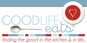
Don’t go crazy with fonts. Print design recommends no more than 3 different fonts on a particular page, but we can get away with a 4-5 on a webpage if necessary. Keep the text clean. For example, Katie didn’t want GoodLife Eats to be in all cursive because that may be a little difficult to read and may have also been a little too busy. It’s fine to emphasize a word or two through use of decorative fonts, as Katie does with the word “eats” but going crazy with fonts can make your header appear disconnected and messy. It’s also best to not take up a huge portion of your reader’s entire screen just with your header (see: Header Do’s).
How Should I Arrange My Columns and What Should I Display There?
Most blogs have a two or three column layout. The largest column is where your blog entries will post. Then you can decide between one or two more additional columns which can be placed side by side (like here on MBA), flanking the main column on the right. Some blogs chose to have two columns flanking their main column on the left, and still others go for a main column in the center, with one narrower column on each side. Really, the choice is completely up to you. Personally, I liked the look of columns side by side on the right of my blog, so I went with it.

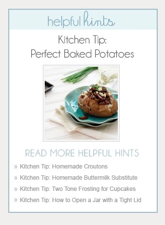
Katie also uses the area to display her popular Kitchen Tips Series and has a nice little design on the sidebar to include a thumbnail image of the most recent tip, plus it’s title and link. Below that are the links to previous kitchen tip posts.

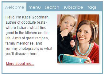
Katie also features a tabbed menu at the top of the sidebar to include information such as her weekly menu, search, subscription information, and tags. You don’t have to organize it in a tabbed menu, but that’s one way to do it – Katie simply wanted a streamlined way to consolidate some information.
Up next design elements such as color scheme, fonts, spacing, etc. If you questions regarding this topic or would like to request a topic, send us an email at questions@mybakingaddiction.com.


I really like your overall ease of navigation. I really love your passion for chocolates. Equally impressive are your photographs. They are stunning. Literally.
Thanks
Thanks for these tips. I’ve been working on designing my own website. I’m learning a little bit at a time. I really appreciate when other bloggers take the time to share :-)
What is the difference between tags and categories? How are they used differently? Setting these up make it easier for someone to search your blog?
i love this website its super super kool !!!!!!!!!!!!!!!!!!!!!!!!!!!!!!!!!lol
Love… Love… Love it! I am new to blogging and your post was extremely informative. Thanks!
This is a great series! Thanks so much for sharing your blogging expertise with all of us out here in blog land. I’ve been blogging for just over a year now and still have so many unanswered questions. I’ll be watching this series for sure!
Thanks for this series! I just recently started myself and started with lots of flowers and colors and curvy fonts, before I realized I wanted the food and posts to be the focus, not others peoples’ graphics!
this is so helpful! When I first started out I have to admit that I had quite the vivid and crazy design but now that I have toned it down to only a few fonts and an easy to read page, I love it ten million times more!
Thanks!
Very cool! Thanks for the help! As someone who is fairly new to the blogging scene this is very helpful :) you totally inspire me!